Trend Trading
The EMA Trend Filter
A moving average only reacts to price — it doesn't decide anything. Here's the structure check that tells you when a trend is actually real.

JustWolves is an educational platform and is not a SEBI-registered investment advisor. Trading financial instruments involves significant risk of loss and may not be suitable for all investors. Past performance is not indicative of future results. Read our full disclaimer →
In this article · 9 sections
Key Takeaways
- Price sitting above (or below) an EMA is not proof of a trend — the average is just lagging behind recent candles.
- Confirm direction with market structure: a clean run of higher highs and higher lows (or the mirror image for a downtrend) before you trust the slope.
- The '1-2-3' sequence — new high, higher low, higher high (or the reverse) — is the simplest filter for staying out of sideways chop.
- Every market has an EMA period it reacts to most. Test 20, 50, 100 and 200 on your own chart rather than copying someone else's default, and expect the answer to change over time.
- The strongest entries appear where an EMA touch lines up with a support or resistance zone that has already been tested more than once.
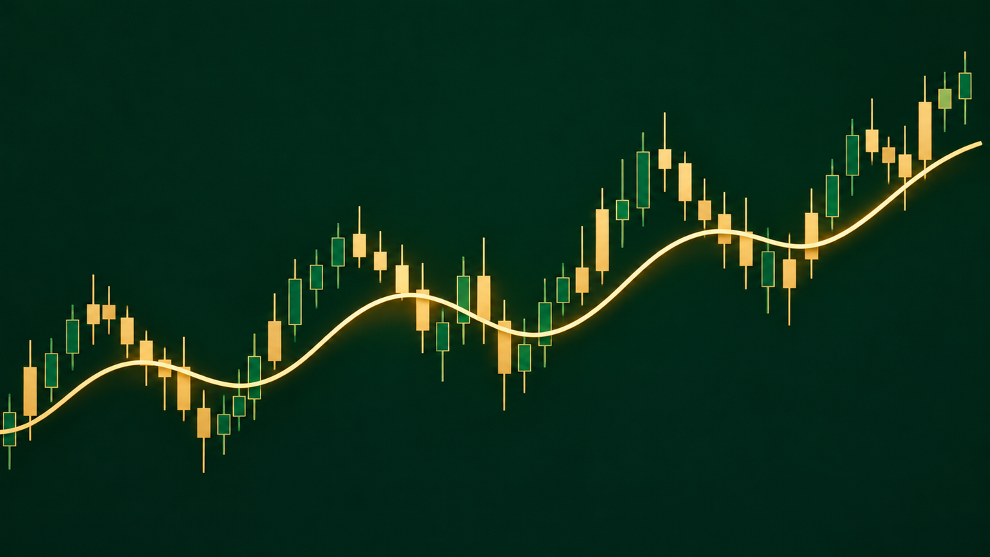
Open ten trading forums and you'll find the same claim repeated with total confidence: price is above the 50 EMA, so the market is trending up. It's one of the first rules new traders memorize, and it's also one of the fastest ways to get chopped up in a range. An exponential moving average is a lagging average of recent closes — nothing more. It doesn't know about support, resistance, or the difference between a genuine breakout and a temporary push into a level that's about to reject.
Why 'above the average' isn't enough
A moving average is a mirror held up to price, not a compass. It shows you where the market has been, smoothed out, and it will always be a few candles behind whatever is happening right now. That lag is exactly why price can sit above the line for a while and still reverse hard — the average simply hasn't caught up yet.
The fix isn't to abandon the EMA. It's to stop treating it as a signal and start treating it as a filter that market structure has to confirm. Structure means the actual shape price is drawing on the chart: the sequence of highs and lows it leaves behind as it moves.
The 1-2-3 structure check
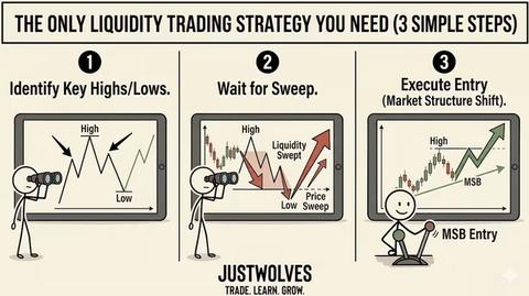
This is the simplest way to separate a real trend from noise sitting near the EMA. In an uptrend you're looking for three moves in order: a push to a new high, a pullback that holds above the prior low (a higher low), and a second push that clears the first high. Flip every part of that for a downtrend.
Confirming an uptrend with structure
Step 1: Step 1 — A new high forms
Price pushes up and closes above the most recent swing high. On its own this proves nothing — plenty of ranges produce a new high before rolling straight back over.
Step 2: Step 2 — A higher low holds
Price pulls back but the low of that pullback sits above the previous swing low. If it closes below the last low instead, you're still inside a range, not a trend.
Step 3: Step 3 — A higher high confirms it
Price pushes again and closes above the high from Step 1. Only now do you have two consecutive higher highs and a higher low between them — the market is trending, not chopping.
Reading it on a live chart
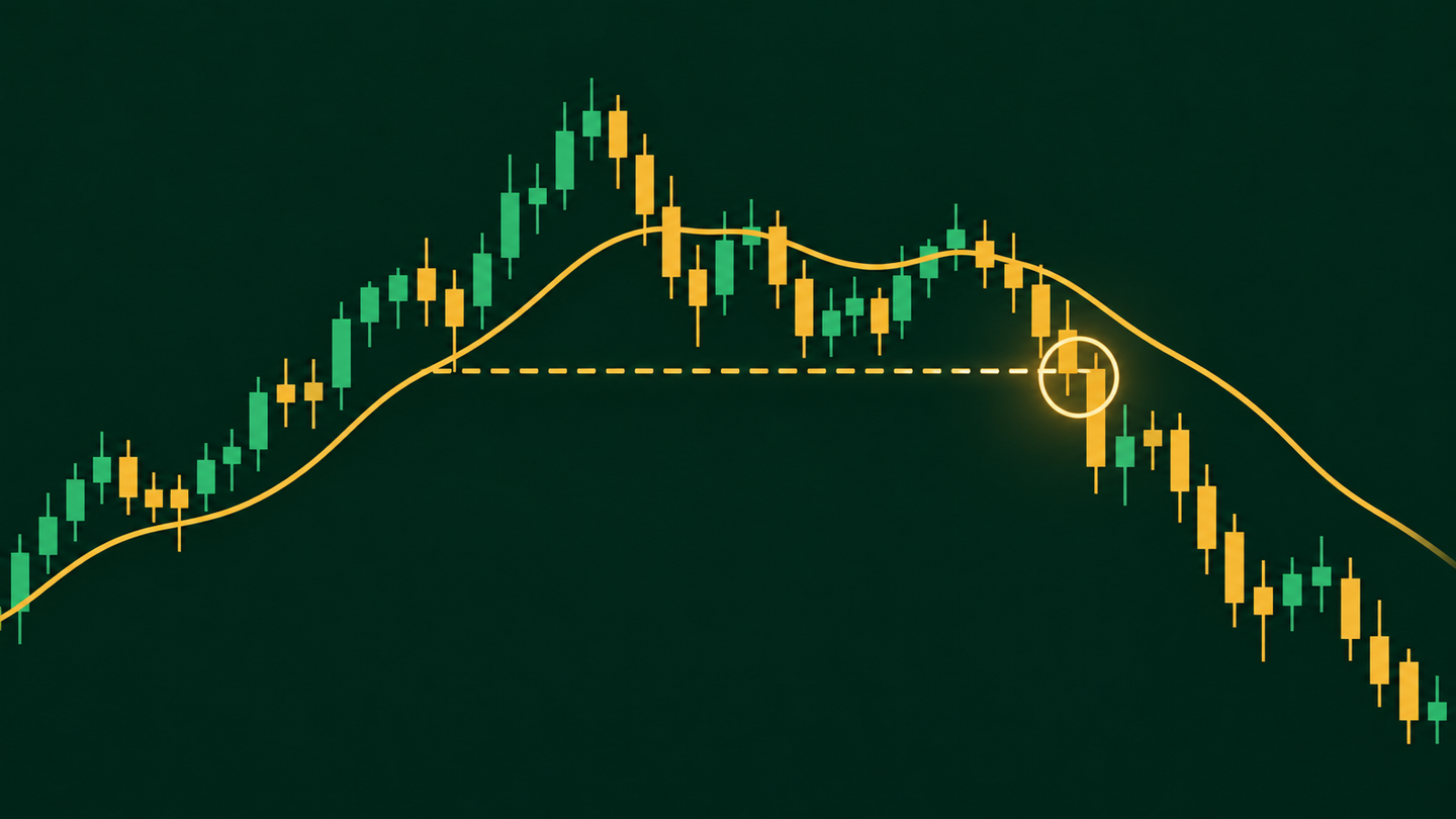
In practice this looks like price dipping below the 50 EMA, drifting sideways, and testing your patience with small pushes that almost — but not quite — break the last swing point. The moment that changes is when a decisive candle closes clearly through the previous high or low. A weak, indecisive close that barely tags the level doesn't count; you want a candle that leaves no doubt the level has been taken out.
Once structure confirms — say, a lower high followed by a lower low in a downtrend, with price below a downward-sloping EMA — the odds favor continuation over an abrupt reversal. That's the moment to start planning an entry, not the moment the EMA was first crossed.
Real Prices: Two Months Above the EMA Without a Trend
The chart below shows the NIFTY 50 from June to September 2026. The index closed above a rising 50-day EMA for most of those three months, which a simple EMA rule reads as an uptrend. The 1-2-3 structure check told a different story from 24 July onward.
Real prices: above the 50 EMA, but not a trend, NIFTY 50, June – September 2026
Step 1 of 4
Above a rising 50 EMA
From mid-June 2026 the NIFTY 50 closes above its 50-day EMA, which is rising from about 23,770. By 7 July it has reached 24,531. By the "price above the average" rule, this is an uptrend.
- What to observe
- A new high: step 1 of the 1-2-3 check.
- Condition
- The next pullback must hold above the previous swing low.
A faster version: draw the range instead
If counting higher highs and higher lows candle-by-candle feels slow, there's a simpler shortcut. When price touches your EMA, mark the swing high and swing low that formed just before the touch — including any wicks that pierce beyond the candle bodies. That box is your consolidation zone. Nothing inside it is a trend; it's just price ranging around the average.
A trend only starts once price closes outside that box — above the top for a continuation up, below the bottom for a continuation down. It's a slightly less precise read than the full 1-2-3 sequence, but it's fast, visual, and good enough to keep you out of the worst chop.
Turn the EMA into an area of value
Once structure confirms a trend, the EMA earns a second job: it becomes a zone where pullback entries cluster. The highest-quality version of this setup isn't just price touching the average — it's price touching the average at the same spot as an old support or resistance level that's already been tested and flipped more than once.
When both groups of traders — the ones watching the moving average and the ones watching the structure level — are reacting in the same small price zone, the reaction tends to be sharper and more reliable than either signal on its own. That confluence, not the touch itself, is what you're hunting for before entering.
Finding the EMA your market actually respects
| Step | What to do | What you're looking for |
|---|---|---|
| 1 | Load the 20 EMA and scroll back through 30–50 past swings | Does price bounce cleanly off it, or slice straight through most of the time? |
| 2 | Repeat with 50, then 75, then 100 | Count clean reactions vs. clean breaks for each period |
| 3 | Repeat with 150 and 200 for the higher-timeframe read | Which period gives the cleanest big-picture trend line? |
| 4 | Compare counts across periods | The period with the most consistent, repeatable reactions is the one this market currently respects |
There's no universal setting. A 50 EMA might be the cleanest trend line on one pair and almost irrelevant on another, where price barely reacts to it but bounces reliably off the 20 or the 200 instead. Treat the EMA period itself as something to test on your specific chart, not a number to copy. And retest it: in our 20-year test below, the best period changed for most stocks.
Do the 50 EMA or Market Structure Predict the Next Month? Our Test
JustWolves tested both filters on 20 years of real daily prices: the NIFTY 50 index from September 2007 and 17 large NSE stocks from January 2006 (Reliance, ICICI Bank, Infosys, TCS, SBI, ITC, L&T, Axis Bank, Bharti Airtel, Hindustan Unilever, Maruti Suzuki, Sun Pharma, Tata Steel, M&M, NTPC, Titan and Asian Paints), all to November 2026. For each day we recorded whether price was above or below its 50-day EMA, and whether the last two confirmed swing highs and swing lows were both rising (structure up) or both falling (structure down). We then measured how often price was higher 20 trading days later.
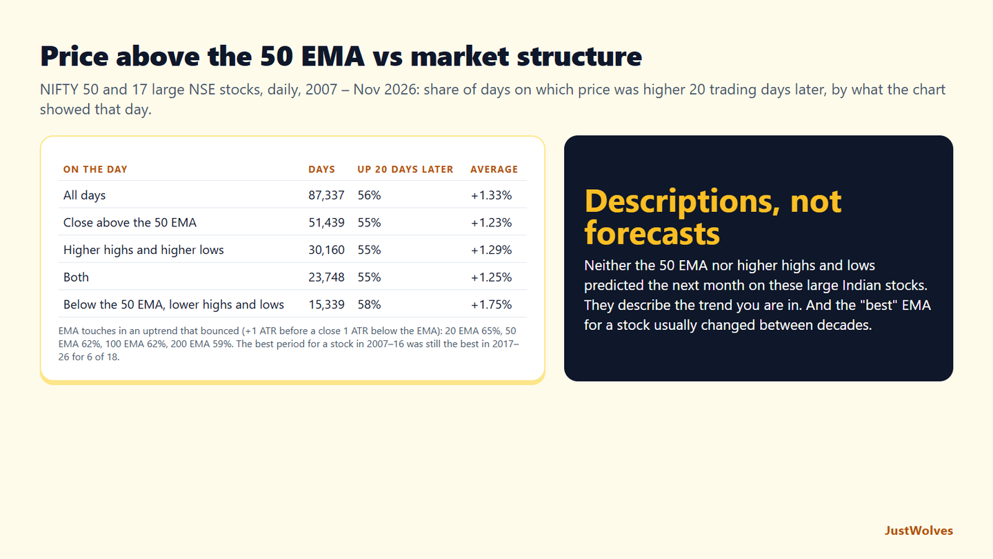
| On the day | Days | Price higher 20 days later | Average change |
|---|---|---|---|
| All days | 87,337 | 56% | +1.33% |
| Close above the 50 EMA | 51,439 | 55% | +1.23% |
| …and the 50 EMA rising | 47,626 | 55% | +1.23% |
| Higher highs and higher lows | 30,160 | 55% | +1.29% |
| Above the 50 EMA and structure up | 23,748 | 55% | +1.25% |
| Close below the 50 EMA | 35,898 | 57% | +1.48% |
| …and lower highs and lower lows | 15,339 | 58% | +1.75% |
Neither filter forecast the next month. Being above the 50 EMA, in an uptrend structure, or both, made no difference to how often these stocks were higher a month later. All three groups were up 55% of the time, slightly below the 56% for all days.
Downtrends were followed by slightly better months. Days below the 50 EMA with falling highs and lows were followed by the best 20-day returns, +1.75% on average. Large Indian stocks over these 20 years tended to recover from pullbacks rather than keep falling.
What this means for the filter. The EMA and the 1-2-3 check are descriptions of the trend you are in, not forecasts. Used as this article recommends, they keep you out of trend-following trades during ranges, and the real chart above shows how. They do not tell you that the next month will be up. Any edge has to come from the entry, the stop and the exit you build on top of them.
Is There a Best EMA? Testing 20, 50, 100 and 200
This article suggests finding the EMA period your market respects. We tested that on the same 18 series. In each uptrend (five candles holding above a rising EMA), we found every candle whose low touched the EMA and checked whether price then rose one average daily range before closing one average daily range below the EMA, within 20 trading days. We call the first outcome a bounce.
| EMA | Touches | Bounced |
|---|---|---|
| 20-day | 1,233 | 65% |
| 50-day | 880 | 62% |
| 100-day | 625 | 62% |
| 200-day | 385 | 59% |
All four periods behaved similarly. Between 59% and 65% of touches bounced, with no period clearly better. The 20-day EMA was touched most often, simply because price is closer to it.
The "best" period did not last. We found the best EMA for each series in 2007–2016, then checked the following decade. Only 6 of the 18 kept the same best period. Reliance's best was the 20-day EMA in the first decade and the 200-day in the second; Tata Steel's moved from the 100-day to the 20-day. A period chosen because it looked good in the past mostly did not stay best.
So test periods on your own chart, as this article says, but treat the result as a rough guide, not a discovery. A level where several things meet, such as the EMA and an old support zone, matters more than which exact period you picked.
Frequently Asked Questions
Does price above the EMA mean the market is bullish?
Not by itself. It only tells you the average of recent closes is below current price — it says nothing about whether the market is trending or ranging. Confirm with structure (higher highs and higher lows) before treating it as a bullish signal.
Which EMA period should I use — 20, 50, or 200?
Whichever one your specific market actually reacts to. Scroll back through history on your chart and count how often price bounces off each period; use the one with the most consistent reactions rather than a default someone else recommends.
What's the fastest way to avoid trading inside a range?
When price touches your EMA, mark the swing high and low that formed just before the touch. Treat that zone as consolidation and wait for a decisive close outside it before assuming a trend has started.
Why did my trade fail even though price was above the 50 EMA?
Most likely the trend was never confirmed by structure — you were trading inside a range that happened to be sitting above the average, not an actual uptrend.
Does price above the 50 EMA predict a rise?
Not on its own, in our test. On 20 years of daily prices for the NIFTY 50 and 17 large NSE stocks, days closing above the 50 EMA were followed by a higher price 20 trading days later 55% of the time, slightly less than the 56% for all days.
Is the 20, 50 or 200 EMA the best?
None was clearly best in our test. In uptrends, 59% to 65% of EMA touches bounced across the 20, 50, 100 and 200-day EMAs, and the best period for a stock in 2007–2016 stayed best in 2017–2026 for only 6 of 18 NSE series.
Related Reading